This customer approached us for an update to their kitchen. As well as wanting to refresh their kitchen space whilst keeping it traditional and in keeping with the property, our customer requested more drawer space and more easy to access storage generally. They felt the current layout and seating area made the kitchen disjointed and there just wasn't a good flow to the space. The customer also loved the idea of a full pantry/larder unit but were dubious about whether there was enough space.
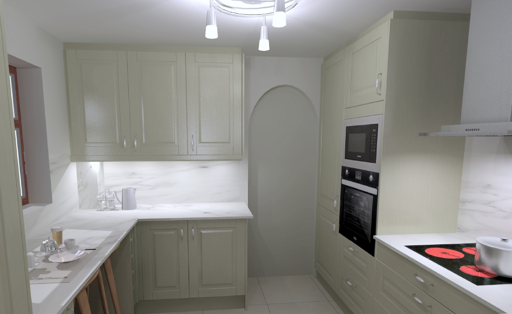
Let's first take a look at the 3D visualisations that were created by our in-house design specialist from specific measurements of the kitchen area. You'll see how each of the 4 key requirements are addressed:
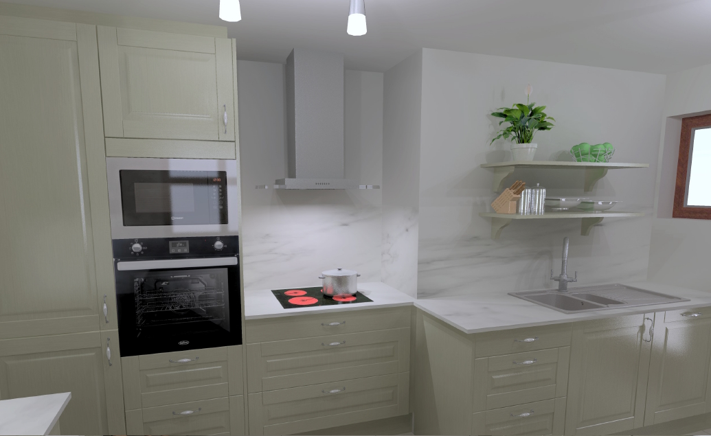
Update design features
The marble effect worktops are a slim, premium, laminate, which gives the illusion of a solid marble worktop and looks sleek with the matching splashback.
The customer opted for an induction hob which means the splashback can run all the way behind the hob without any heat issues, creating a clean, fresh, seamless look.
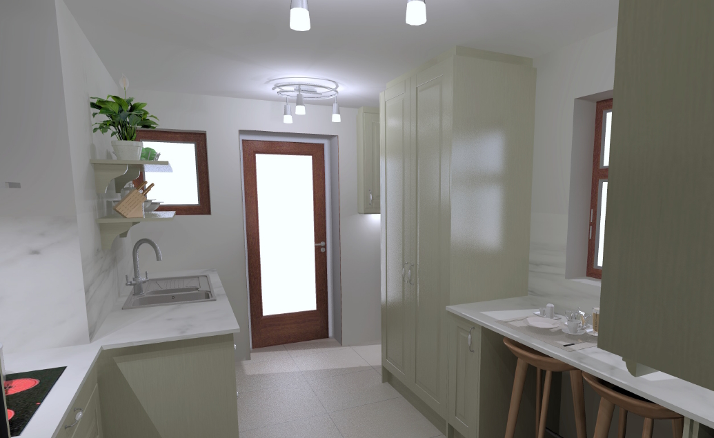
Keep traditional look
The kitchen units chosen are 'Ashton' from Crown Imperial, which has a solid ash door. The customer chose them painted in Green Grey. The carcases were provided in an oak effect, however, the pantry internals are all made from solid oak and oak veneer.
Whilst adding a modern colourway and new handle design, the kitchen cupboards are still similar to the original kitchen which fits the brief perfectly.
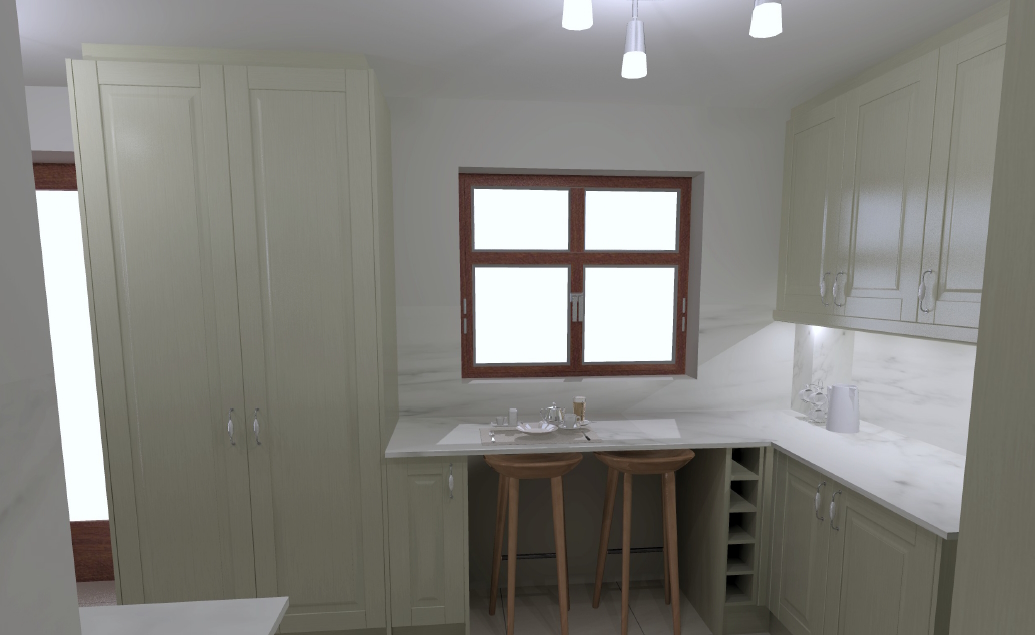
More storage
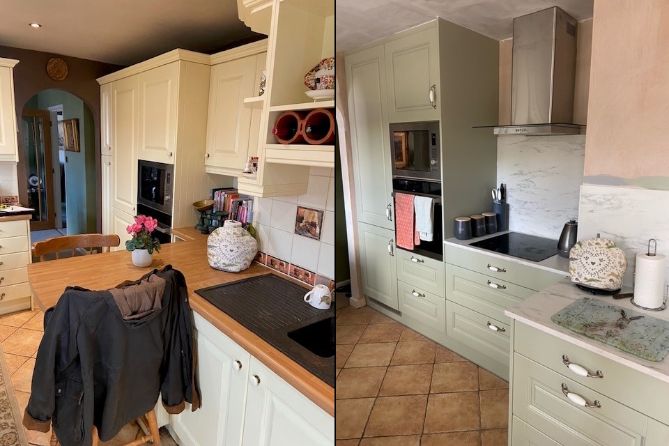
The design uses tall height units and has them scribed to the ceiling in order to fill the void, often described as a dust trap. This makes the most of all available vertical space.
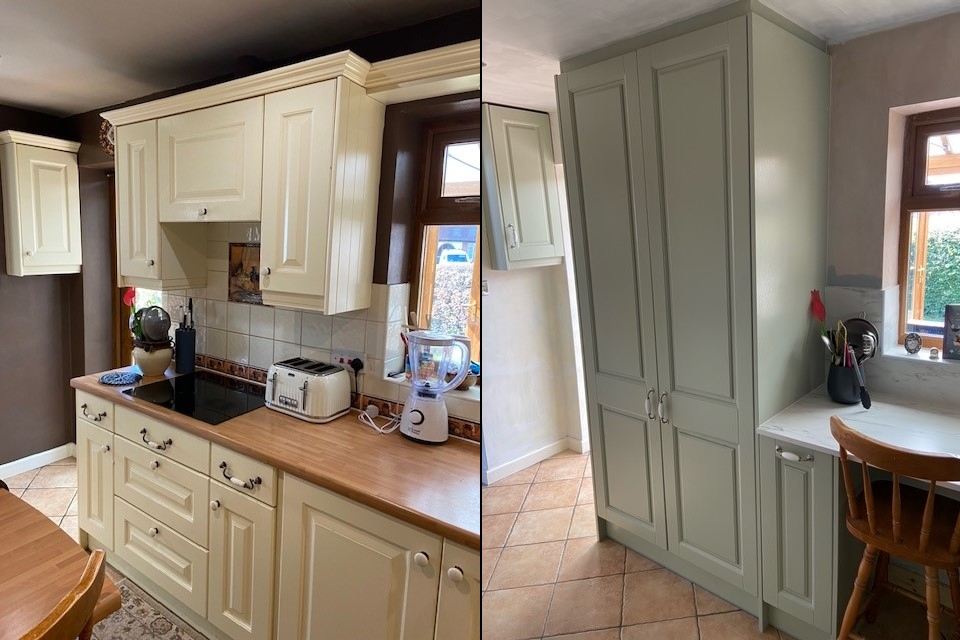
The customer was also delighted that we could fit in a larder unit (left of window) which is also tall height giving them the maximum storage possible.
Better layout
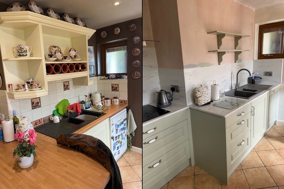
The biggest change was to move the seating area. By moving the seating to under the window our customer would be able to make the most of their views outside. With the original seating area removed it freed up that space to create an easy-to-use cooking zone with lots of drawers and allowed the hob to be moved to the same side as the sink and oven.
Before and After pictures
Whilst the walls are still to be painted, I am sure you will agree with us that the space has already become lighter and brighter. With this great new layout we hope the kitchen will be enjoyed by its owners for many years to come.
Before|After
Before|After
Before|After
Colour Supplies supplied and fitted the kitchen, completed all electrics, plumbing and plastering, with the final verdict from our customer saying that our installers were "outstanding".
If this has inspired you to think about how to refresh your kitchen, then our in-house, friendly design team is here to help and guide you through the whole process. You'll find some really helpful tips on starting to design your kitchen here. Or just click this link below.
Book a FREE Kitchen Design Appointment
You can also pop in to have a chat with a member of the resident design team in either our Wrexham or Oswestry stores to find out more, and get inspiration from our lovely showroom kitchens.
Related Articles
Mosaic Tile sheets
Colour Supplies stock a range of mosaic tiles, already on sheets for easy fitting, and in a variety of colours, textures and shapes.
Spring Cleaning made easy
Did you know you can do a complete spring clean with cleaning products from Colour Supplies, by using our specialist cleaners from HG?


